

Project Three
Website Design for Electrical Products
Purpose
The goal for this project was to create a full design for a public-facing website for a division of a global client. The website is meant to act as a hub for all the division’s high level documentation, videos, and 3-d models of their products, as well as recordings of webinars, product launches, and any other content that the client might want to push.
I was given the original hi-fi Figma mockups for this project, which was among the first of its kind for this division, as they typically produced B2B products, and hardware. Due to this, the original design didn’t adhere to the global standard of the client, as well as other modern design trends and rules.
Using the given mockups, coupled with the research on the brand and various tools I managed to acquire from the global client, I created the final interactive prototype that had increased usability, a modern feel, and properly aligned with the brand’s style guide.
I created the interactions by using the components and variants feature in Figma.
Here are some interaction designs I created for this project.
Objectives
Recognize the Audience
Who are the users? What do they typically expect out of a media viewing website? I used Jakob’s law to ensure that my design worked in a way our users would be familiar with through the use of other sites, like Youtube, Netflix, and various other streaming services.
Understand the Product
In contrast with most of this division’s other work, the website would be B2C, displaying their products outside of typical internal use. I worked closely with the dev team to understand product specs and functionalities to include in the design.
Know the Brand
As noted earlier, the division I was working for primarily created hardware and B2B software, so they didn’t have their own digital brand style guide to adhere to. I did an analysis of the client’s global websites, and found internal assets to replicate the look and feel of them as closely as possible.
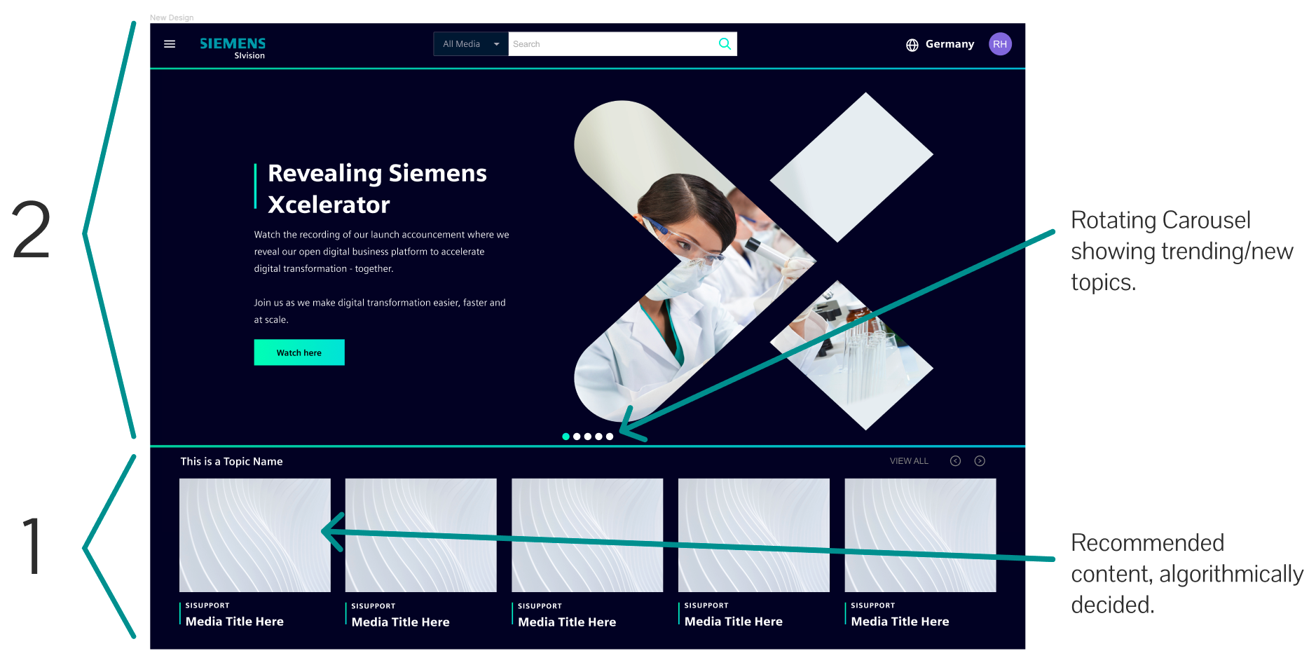
Original Design

The original design provides all the proper mechanics that a user would want in a media content viewer. At the top there’s a rotating carousel that shows trending and new topics, below, recommended content is pushed to the user, algorithmically decided.
The components were provided in a 1:1 ratio, which goes against the typical design rule, the Rule of Thirds. A basic design theory, the Rule of Thirds captures a user’s attention and creates a visually pleasing and intuitive layout.
My Design
My redesign provides all the original functionality, but with the modern, client’s feel. I maintained the carousel and the recommended content, but utilized the Rule of Thirds to block out the layout in a visually appealing way.
Other aspects that I updated in adherence to the brand style guide were the font style, iconography, button styling, language selectors, interaction animations, and more.
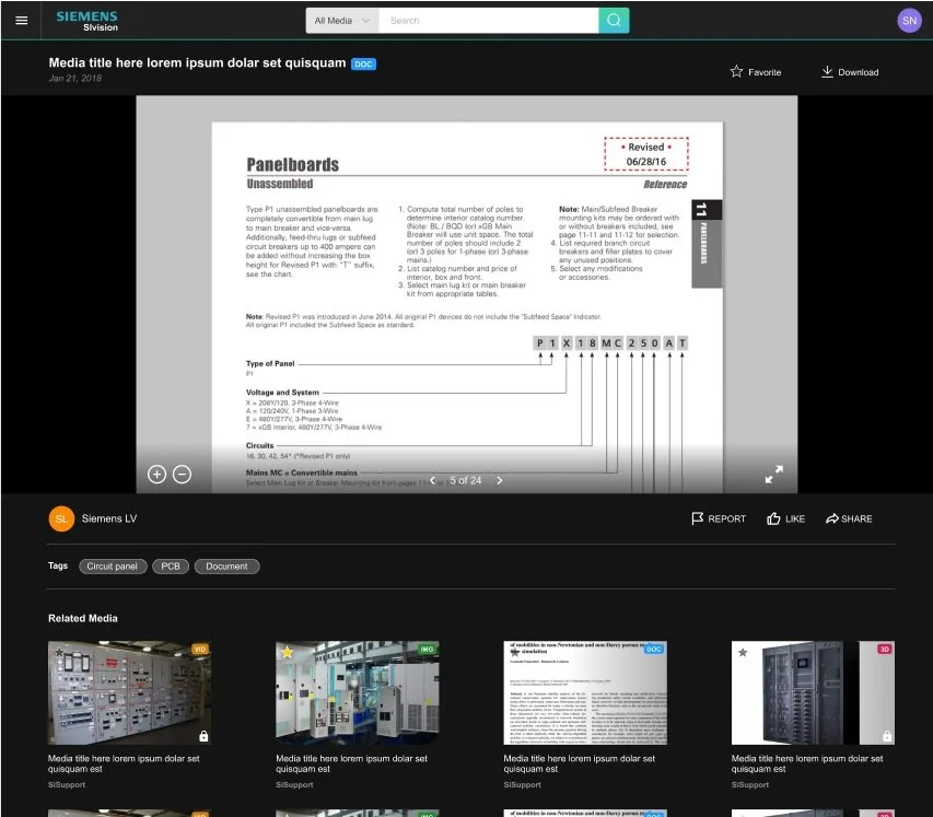
Original Design
My Design
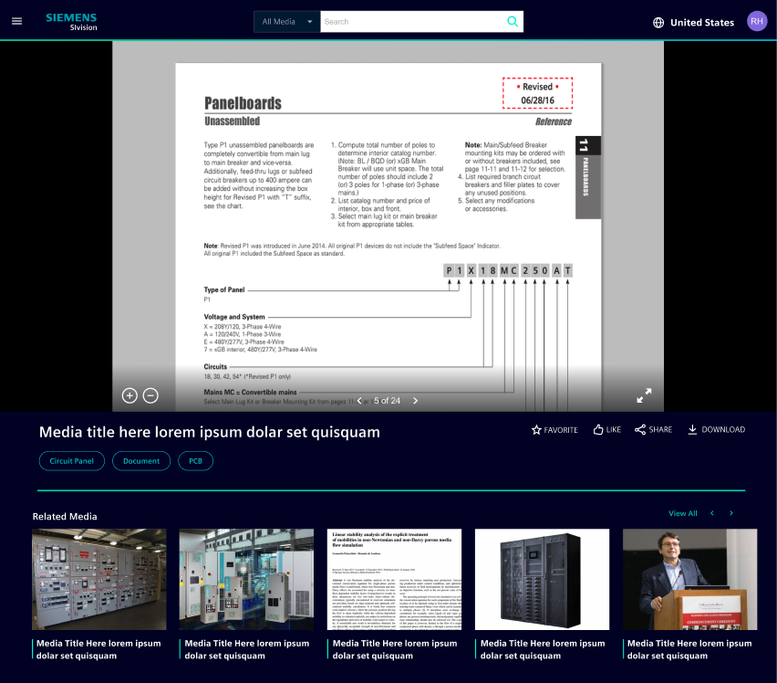
Regarding the content viewer, I had to update more than styling. I had chosen to move the title bar below the content viewer, rather than keep it at the top as in the original design- allowing for the viewer to be flush with the navigation bar, and ensuring that all content info is placed together in one place below the viewer. In moving the title bar below the content viewer, this also allows for the functions that were originally placed above (“Favorite” and “Download”) to be placed with the rest of the actions that a user can take (“Like” and “Share”).
In studying the brand and its global websites, I noticed that simplicity was the strongest attribute to describe the pages. Every asset and interaction was clean, simple, and modern, so I made sure to reduce unnecessary designs when possible. I also got rid of unnecessary titles, like the “Tags” text, allowing the design of the pills for each tag to speak for itself. Another section I got rid of was the uploader’s name and icon. While internally, different teams might upload assets for different products, this doesn’t have any effect on the user, as to them, all of the products are created by the client. By approaching the site design with a new user in mind, I was able to bring a perspective that aided not only in the development of the product, but in adhering to the brand’s style and its push for simplicity.
Additional Design
Light & Dark Modes


Project Result
I presented my redesign to over 30 members of the client’s team, dictating the project, my process, specific design changes and why they were made, and walked them through the semi-functional interactive prototype.
My design was accepted by management, and basic brand alignments that I had outlined were used for the initial beta release, and the updated design will be used for the final product.
Like this project? Reach out to me to talk about it!